Unit 2 Task: 2015
Fantastic & Strange
Fantastic & Strange


For my year 11 project I have picked the theme Fantastic & Strange. I chose this because I felt this suited my style of photography best out of all the topics. It was also the most broad topic so it meant I could experiment with a lot of different styles and take photos of what ever I considered fantastic or strange.
|
Jerry Uelsmann
http://www.uelsmann.net Jerry Uelsmann born in 1934 is an american photographer. Uelsmann is famous for his photo montages. Photomontage - The process of making a composite photograph by joining two or more photos into a single image. Uelsmann began creating images from multiple negatives long before photoshop was available. He believes that it is equally difficult to create good images no matter what tools you use. He says "I see the incredible options that Photoshop provides, but the bottom line is the technique has to fit with ideas and images". My favourite photo by Teske is the first image in the slideshow of a newspaper boy standing on a street corner of Los Angeles. This photo is my favourite because it captures the facial emotions of the young boy standing for hours on end trying to make some money selling newspapers. I like that Edmund Teske has taken the photo so close to the boy as it puts all the focus completely on him, the boy is not even looking at the camera which make me think he either didn't know the photo was being taken or he was posing for the camera. I can tell this photo was taken in the early 40s because of the clothes the man behind him is wearing and the styling of the car in the background. This photo looks great just as a negative because the light colours in the background blend in together and the boy almost blends into the background. The only colours that show up are the dark colours such as the boys jeans, the lamp post on the left of the photo and all the shadows.
|
My favourite image by Uelsmann is the first one in the slideshow of five people standing on a beach looking at a tree. This is my favourite photo because it has a good composition with the tree being the main focus and taking up half the image, then the people being in the bottom half. The line where the beach meets the sea is also at a 45° angle, this breaks up the image because the point where the two photos meet is already a horizontal line. I also like the fact that the line where the two photos meet is not completely flat, instead it is a rough, jagged line which matches the overall style of the image.
Edmund Teske Edmund Teske was born in Chicago in 1911, he was a 20th century experimental photographer. Teske's photography techniques include montages, combined prints and solarizations. In the mid 1940's Teske moved to Los Angeles, where he worked at Paramount Pictures. He began to exhibit his photographs more often and increasingly experimented with different techniques that led him to his use of the Solarization technique, reverse highlight and shadow. |
Double Exposures
Multiple Exposure - The superimposition of two or more exposures to create a single image.
Multiple Exposure - The superimposition of two or more exposures to create a single image.


My Double Exposures


Evaluation
My first double exposures went alright, I am not that pleased with them as most of them are either too bright or too dark. My most successful image was the one in the top left, I am very pleased with the outcome of this photo. I think the contrast of the dark black photo with the light white photo work well together and the sharp line where the photos meet cuts up the photo into two sections to really make for a more interesting image. If I made these again I would make sure to not leave them exposed for as long.
Experiment 2


I took these photos on an iPod and used an app called 'Lomo' to edit them. I am not that pleased with them because I was rushed when taking the photos and so the finished photos were not as good as they could be. If I took these again I might use a variety of photo apps to show a wide range of strange effects rather than a selection of photos that look relatively similar to each other. I would also liked to use a double exposure effect app, as I would like to recreate some of the artists work that I have researched. My favourite image is the top left B&W photo. I like this because it shows four different angles all taken by standing in the same place. I like the bold geometric shapes and angles that structure these photos, these shapes work well in black and white because it makes them stand out better and emphasises the shadows and highlights. If I took these again I would probably take more black & white photos as they were the most successful ones, I would also like to focus more of my images on architecture as this tends to look good in black & white as it shows off the shapes and design of buildings because it puts all the focus on the building as colour is not competing with the main object in the image.
Experiment 3


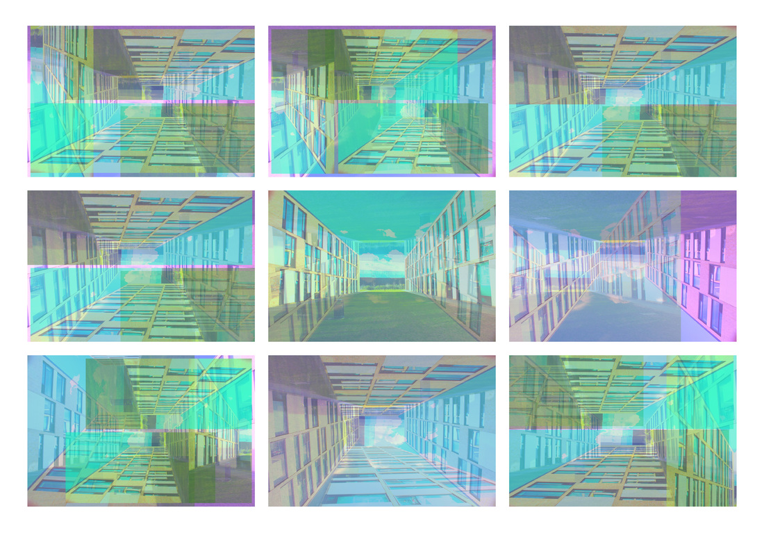
For my third experiment I took a single photo and then edited it to make these double exposure collages. On the right is the original image. I first started by editing the contrast, saturation, exposure, shadows and temperature on Adobe Photoshop. Once I had done this I still found the photo a bit boring so I experimented with changing the tint and opacity. This created some cool effects so I next began rotating individual images and overlaying them on others, this made some interesting patterns and colours, as a group I think they look really good together and look almost like a drawing. If I did this again I would use a tripod and wait until there was no shadow covering the grass.
|
Artist Research http://www.fanetteg.com
Emma Martin Emma Martin is a self employed London photographer who loves architecture. She often goes to light shows and photographs amazing patterns projected onto elaborate buildings. She also creates her own patterns which he overlays onto buildings herself by using Adobe Photoshop. My favourite photo by Martin's is the first in the slideshow. It is a striking black and white photograph of a tourist information building opposite St Paul's Cathedral. I like this because of the contrasting pink and sea green colours she has added on Adobe Photoshop to light the building. I like the fact she has chosen to use black and white because it emphasises the amazing lighting, I also think the coloured reflections on the ground look really realistic and help to make the image. |
Fanette Guilloud Fanette Guilloud is a young photographer from France. In 2013 she graduated from photography school in Toulouse. Her unique style combines photography with creative installation art. Guilloud is attracted to geometry and minimalist designs which she uses to create powerful images, with brutal shapes against usually quite rough, industrial settings. These sleek, calculated shapes create a good contrast against the dirty, messy backgrounds they are placed in. They work well because you would not expect perfect geometric shapes like these to be in an environment like this. My favourite photo is the last one in the slideshow. I like this because it is quite a complicated shape in an awkward place so it would have been very hard to create the perfect angles for it to all line up especially as it is matching up across an open door frame. I like the way the image is presented; the grubby, council block style blue and brown mosaic tiles and dirty off white door all add to the mise en scène of the photo.
I think the shape itself is also well created with the colours of it matching the walls, door and skirting boards. The matching colours ensures it does not look completely out of place in the surroundings it is placed in. |
Experiment 4 - Double Exposure


I was inspired by Emma Martin's photographs where she overlaid light patterns onto buildings. This gave me the idea to make my own version of her work. Instead of designing patterns I took a close up photo of the branches on a tree and cropped it to fit onto the wall of the buildings. I then changed the opacity on Photoshop and experimented with numerous filters to give the image different effects. For the above images I rotated the tree image to make it the same angle as the building and so look as if it is actually on the wall. I think that these photos were quite successful as they are a good example of overlaying images and make the photograph much more interesting and unusual than if it was not edited. If I created these again I would probably take photos of a more interesting building and experiment with more unusual angles to create more strange effects. Doing this would make the focus on the building as well as the tree effect, so I would be able to create a more interesting composition with experimenting with the low and high angles of the building which would show off the architecture.
|
Norman McLaren
http://www.mclaren2014.com Norman McLaren was was a world renowned film maker born in Scotland in 1914. McLaren briefly lived in New York at the beginning of World War 2, before immigrating to Canada where he went on to become one of the most awarded filmmakers in the history of Canadian cinema. In 1968 McLaren directed a short dance film called Pas de deux. I think Pas de deux is a very well choreographed film and shows amazing movement presented in a beautiful way. The black background means that you solely focus on the dancers and the carefully placed lighting creates elegant shadows outlining the edges of the dancers. |
|
Pas de deux (1968)
Experiment 5 - Film photos
For my fifth experiment I was inspired by the multiple frame images taken by Norman McLaren so I used a 35mm lomography camera to take four sequentially operated photos all on one image. I am quite pleased with these photos, especially the first one with the bright red colour which was caused by being the first photo I took using the film. This is my favourite photo because it is a striking image that really stands out with the bright red that contrasts against the the other half of the photo. The cool shape of the street lamp works very well in this style of photograph as it has a very noticeable design with the long tall pole and triangular lamp at the top, I think the overall appearance and styling of this photo has a 1930s art deco design to it. If I took these photos again I would take more images of moving vehicles and people because it would make the photos more interesting as the object would be in a different place in each photo depending on how fast they are moving. I would also do more experiments with moving the camera as I press the shutter to create blurred images and images where only the object in motion is in focus. I would also spend more time thinking about how I want to setup the composition of my image before I take the photo.


Final Piece
For my final piece I decided to use images from my third experiment because I felt they were the most successful. I am really pleased with the way these designs turned out and I think the magenta, turquoise and blues work well together. I first edited them for printing as when I had designed made them I made them with RGB colours for the web so I had to re-create them with CMYK colours, once I had done this I then experimented with many different arrangements and layouts for displaying my finished work. I rotated some images and then finally decided on a 3X3 arrangement with each image mounted on foam board. I then decided to mount all my images straight onto the wall instead of glueing them all onto mounting board as this would create a much cleaner, more professional look that would be most suitable for the style and arrangement of the images. If I made these again I might add a pattern over the images to create a different style for each image, I also might use more than just one photograph for all of the images to make more complex designs.